A Beginner's Guide to Storybook: Supercharge Your UI Development

A passionate 'Web Developer' with a Master's degree in Electronics and Communication Engineering who chose passion as a career.
I like to keep it simple. My goals are to focus on typography, and content and convey the message that you want to send.
Well-organized person, problem solver, & currently a 'Senior Software Engineer' at an IT firm for the past few years.
I enjoy traveling, watching TV series & movies, hitting the gym, or online gaming.
In today's fast-paced web development world, building scalable, reusable, and consistent UI components is crucial. As user interfaces grow more complex, developers need effective tools to manage their UI components in isolation. Storybook is one such tool that has revolutionized how developers design, test, and document components. Whether you’re building a React, Vue, Angular, or plain HTML application, Storybook offers a powerful environment to develop UIs efficiently.
In this blog post, we’ll explore what Storybook is, why it's valuable, and how you can use it to streamline your UI development process.
What is Storybook?
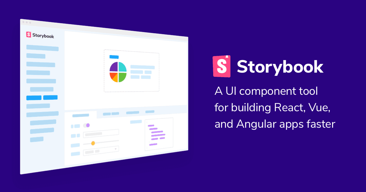
Storybook is an open-source tool that allows developers to build and test UI components in isolation from the rest of the app. It provides a sandbox where you can visually develop components independently, without having to worry about business logic, data fetching, or the overall structure of your application.
It works with popular JavaScript frameworks like React, Vue, Angular, and even HTML. This flexibility makes Storybook a valuable asset for projects of any size or complexity. With Storybook, each UI component can have its own "story," which represents a specific state of that component, such as how it looks with different props or configurations.
Key Features of Storybook
Component Isolation
Storybook lets you work on a single component at a time, independent of your app's logic. This makes it easier to focus on designing, building, and testing the component's UI without distraction.Interactive Playground
Storybook provides an interactive environment where developers and designers can see how components behave in real time, test different states, and fine-tune visual details. This playground enables rapid prototyping and feedback loops.Documentation
One of Storybook's strengths is its ability to generate automatic documentation for your components. As you write stories for your components, Storybook captures that information and creates a living style guide that your team can reference.Add-ons
Storybook is highly extensible, thanks to a wide range of add-ons. Whether you need tools for accessibility testing, viewport adjustments, or performance monitoring, there's likely an add-on to support your needs.Testing and Debugging
Storybook's isolation of components simplifies the process of testing. Tools like Storyshots (for snapshot testing) and Visual Regression Testing add-ons allow developers to test the visual appearance of components to ensure nothing breaks as the UI evolves.
Why Use Storybook?
1. Faster Development
When working on a large project, the ability to develop components in isolation helps you avoid the overhead of dealing with the full app setup. You can build, tweak, and test individual components without loading up the entire application. This speeds up the UI development process significantly.
2. Improved Collaboration
Storybook is not just for developers—designers, product managers, and QA teams can also use Storybook to review UI components. Since components are neatly organized and visually accessible, it becomes easier for non-technical stakeholders to understand how the UI will look and behave. Storybook effectively becomes a shared language between teams.
3. Maintainable UI Library
In larger projects, UI libraries can get out of hand quickly. Storybook allows you to manage and document components in an organized way, reducing the risk of redundant or inconsistent designs. Storybook’s auto-generated documentation is also a boon for onboarding new developers.
4. Design Consistency
By seeing components in isolation, teams can maintain more consistent design patterns across the entire application. It becomes easier to spot deviations from the design system, ensuring that components follow brand guidelines and accessibility standards.
Getting Started with Storybook for React
Let’s walk through how to get Storybook up and running with a simple React project.
Step 1: Install Storybook
To begin, you’ll need a React project. Once you have that set up, you can install Storybook using the following command:
npx storybook init
This command will install all the necessary dependencies and set up the basic configuration for Storybook within your project.
Step 2: Create Your First Story
Next, you'll want to create a story for a UI component. Let’s say you have a Button component in your src/components/Button.js file. Create a file named Button.stories.js in the same directory:
import React from 'react';
import Button from './Button';

export default {
  title: 'Button',
  component: Button,
};

export const Primary = () => <Button label="Primary" />;
export const Secondary = () => <Button label="Secondary" />;
This defines two stories: Primary and Secondary. Each represents a specific version or state of your Button component.
Step 3: Run Storybook
To start the Storybook development server, run the following command:
npm run storybook
Storybook will open in your browser at http://localhost:6006, showing your components with the stories you’ve defined. Now, you can interact with these components, tweak their props, and see the results instantly.
Step 4: Explore Add-ons
Storybook has a rich ecosystem of add-ons to enhance your workflow. Some popular add-ons include:
Actions: Helps you log events (like button clicks) triggered in your components.
Knobs: Allows you to dynamically edit component props directly from the Storybook UI.
A11y: A tool to check the accessibility of your components and ensure compliance with standards like WCAG.
To add an add-on, install it via npm and configure it in your .storybook/main.js file.
Best Practices for Using Storybook
Write Meaningful Stories
Ensure that each story represents a real use case. It’s best to write stories for different states of a component, such as loading, disabled, or error states.Organize Your Stories
Group your components logically within the Storybook UI. You can create hierarchies using slashes in thetitlefield:export default { title: 'Forms/Button', component: Button, };Keep Stories Updated
As your components evolve, remember to update your stories. Treat them like unit tests—they need maintenance to remain useful and accurate.
Conclusion
Storybook is a game-changer for UI development. By enabling developers to build and test components in isolation, it fosters faster development cycles, better collaboration between teams, and maintainable, consistent design systems. With its powerful features, extensive add-on ecosystem, and ease of integration with popular frameworks, Storybook has become an indispensable tool in the modern UI development toolkit.
If you’re serious about improving your front-end workflow, Storybook is a must-have. It will help you build UI components that are not only visually stunning but also robust and reusable across your entire project. Happy coding!


